BBK Brandenburg

Problem
The BBK Brandenburg needed a contemporary visual identity that reflects its role as a representative of professional artists while remaining flexible across diverse communication formats. The challenge was to create a system that balances professionalism with artistic expression and works equally well in internal contexts and in public campaigns.
Insight
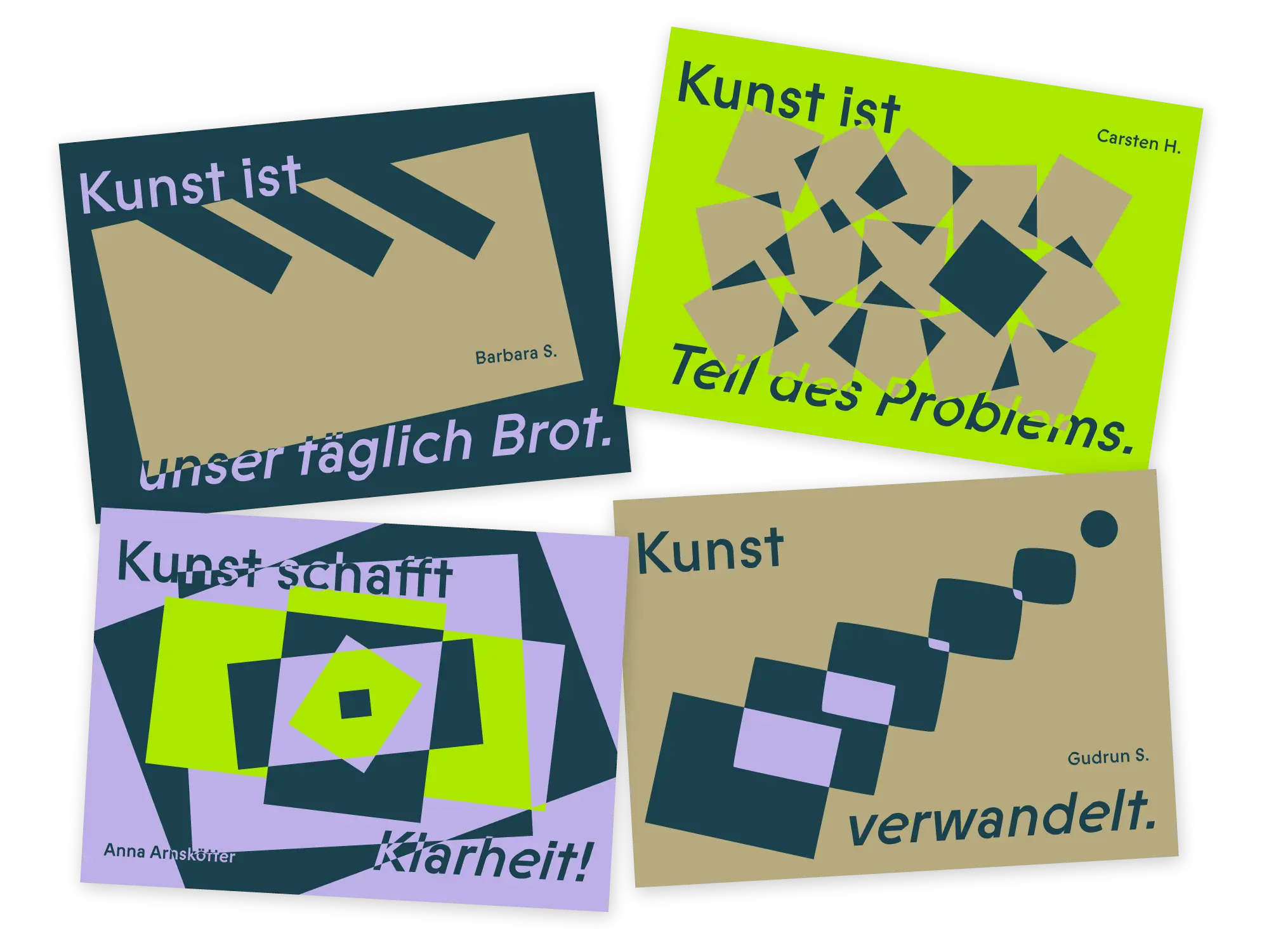
To strengthen the visibility of the association and its members, the identity should embody what art stands for: being bold, unexpected and out of the box. This became the conceptual core of the project – positioning the BBK not as a static institution, but as an active presence within the art world.
Approach
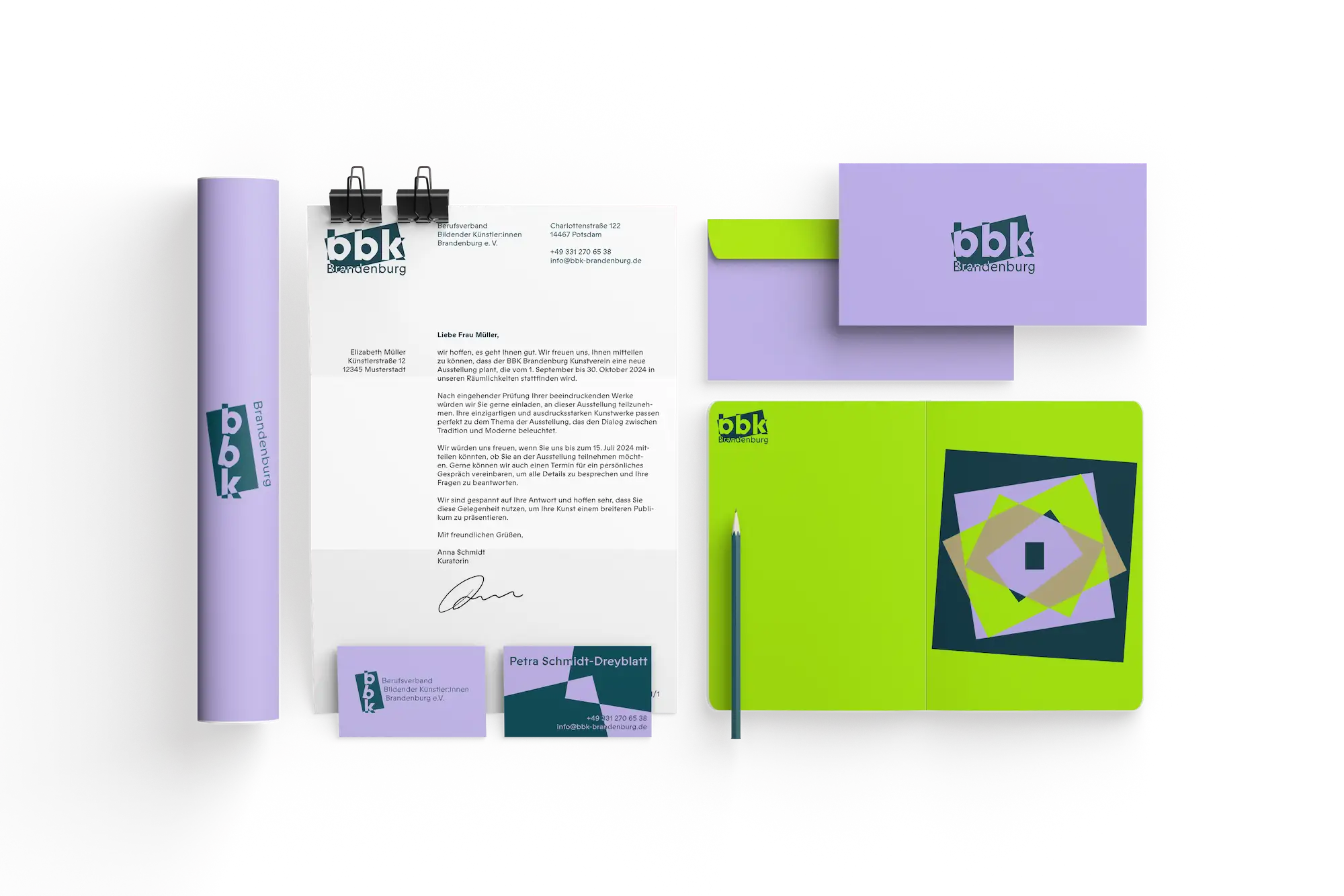
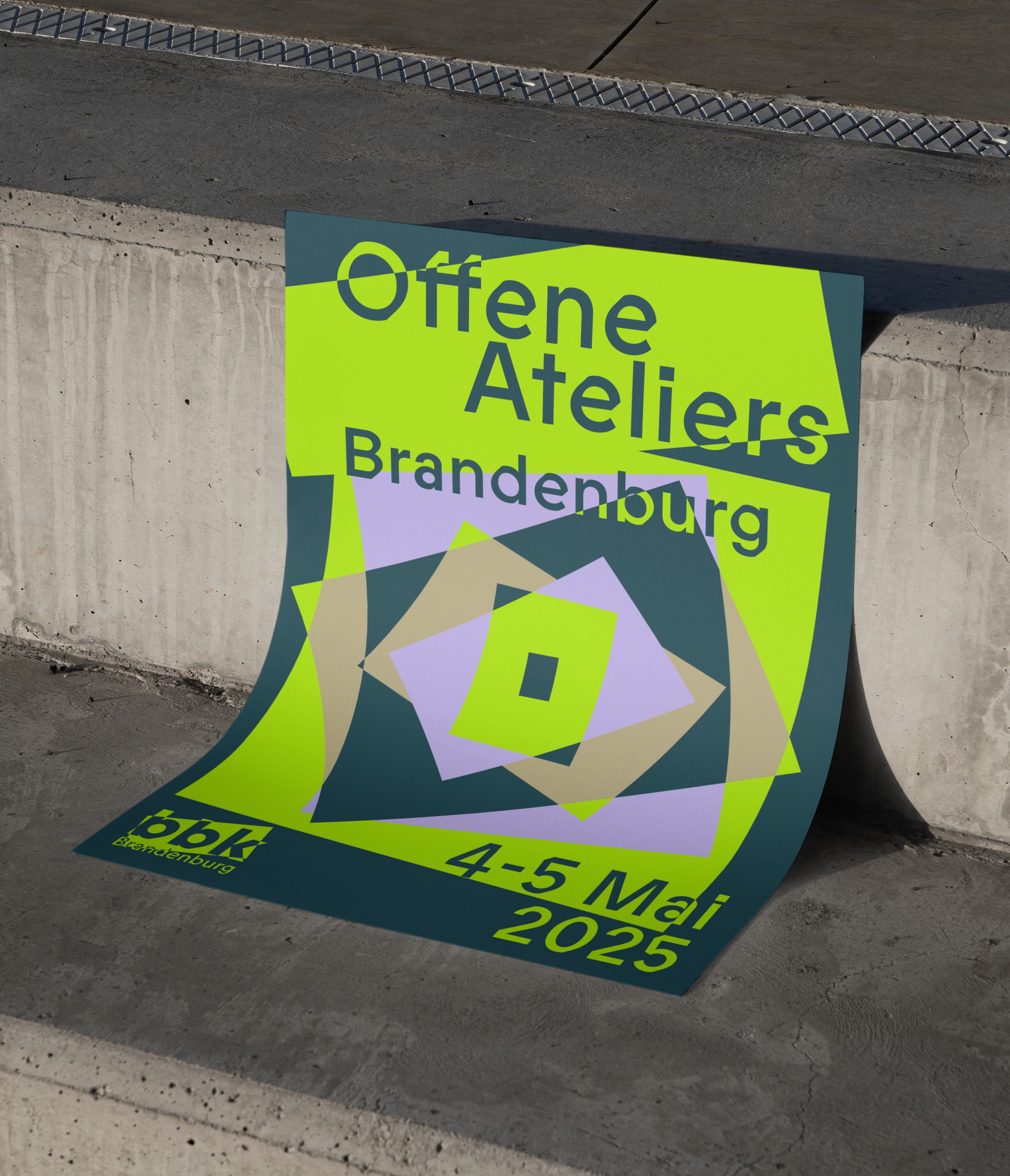
I developed an adaptive design system centred around a modular logo and expressive typography. The visual language plays with structure and disruption and combines a functional base with bold variations that respond to different contexts.
Concept Development
At first, I experimented with different analogue materials to find a concept and a visual language.
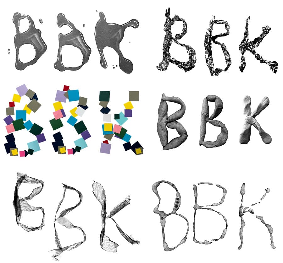
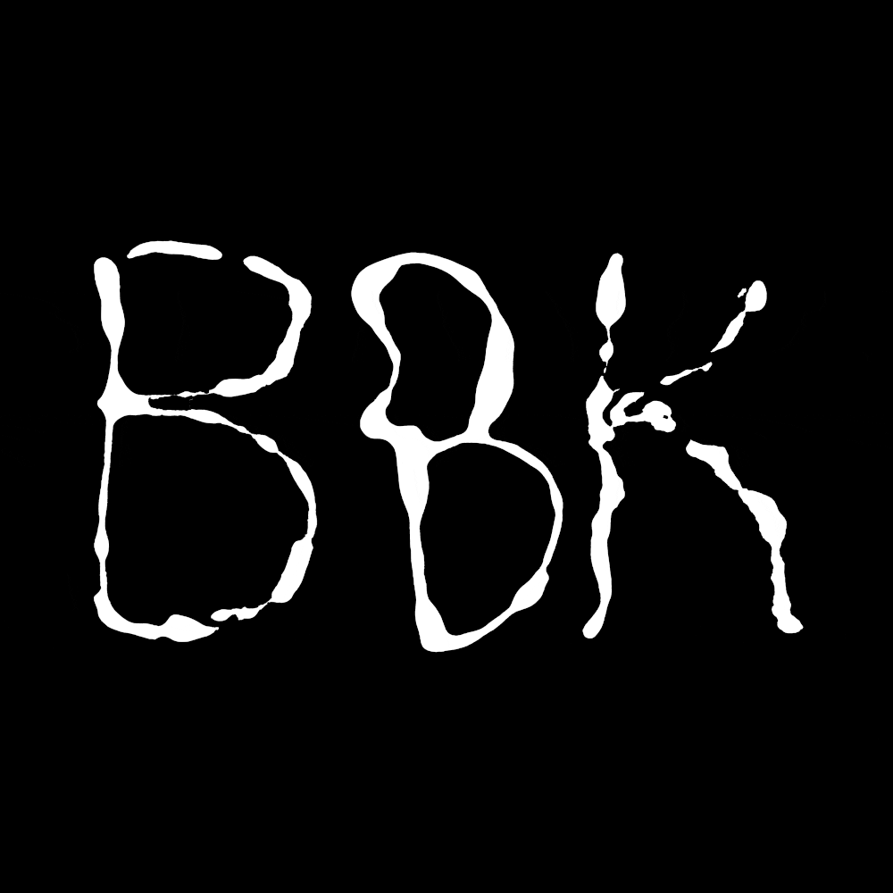
Out of the box
Art must connect with its audience. It should be unconventional, bold and a little unexpected – these are the values I set out to reflect in the design.

Logo Variations
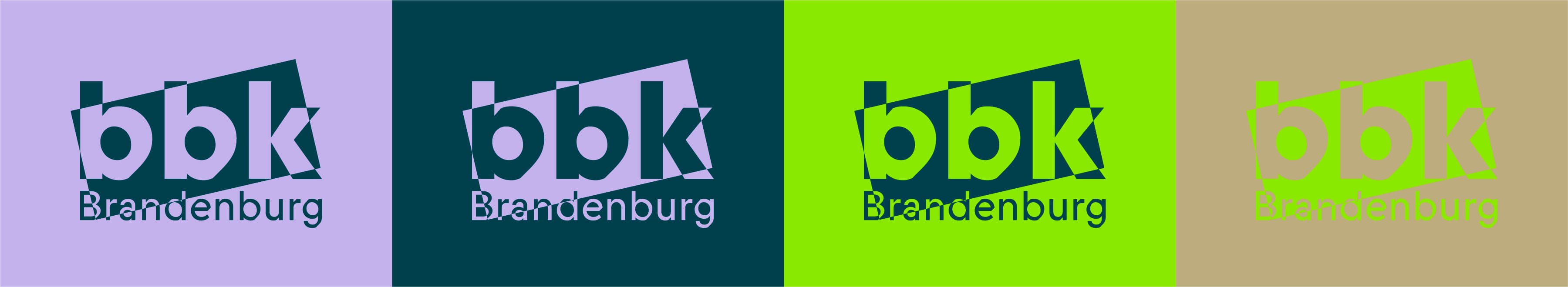

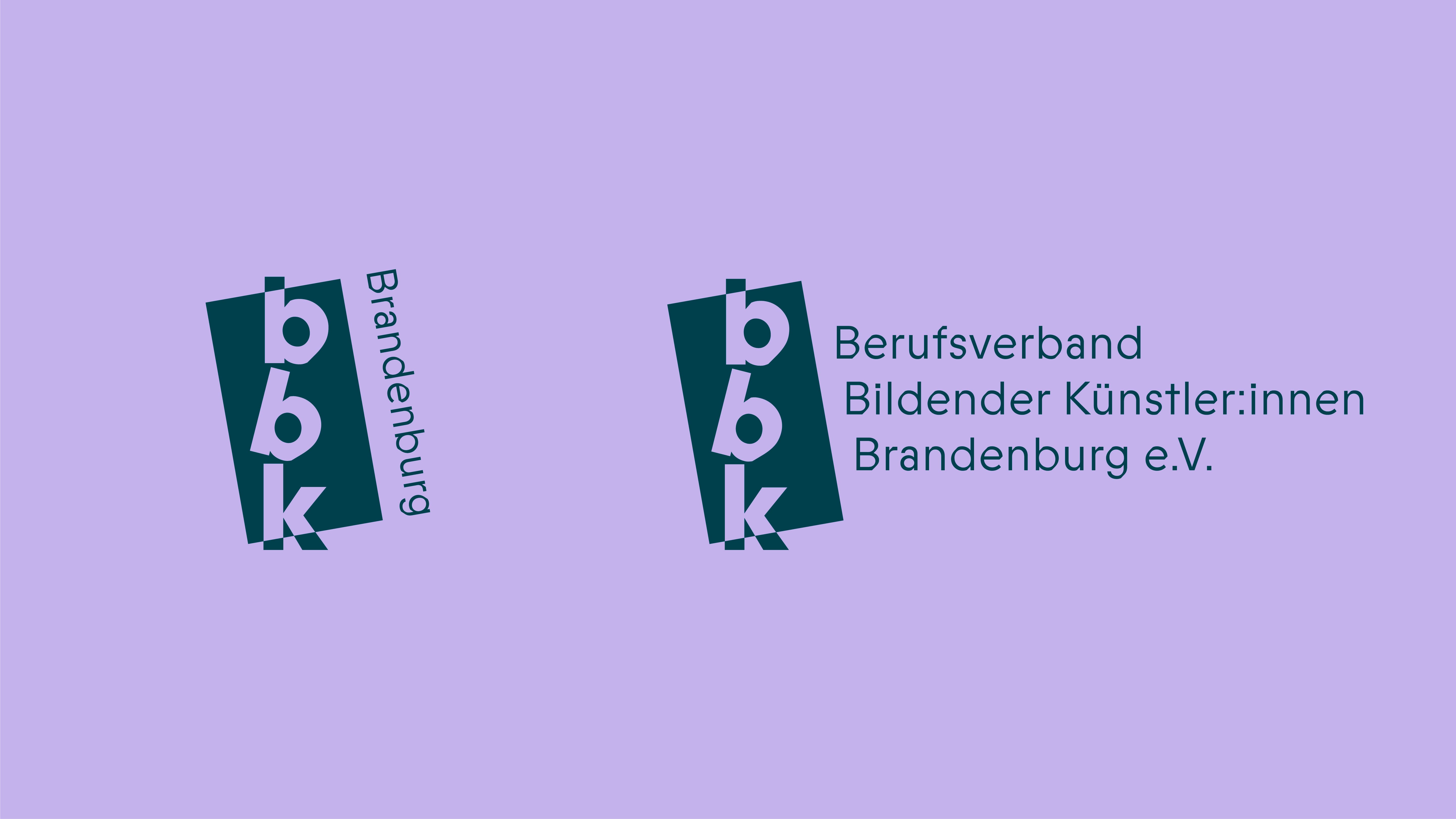

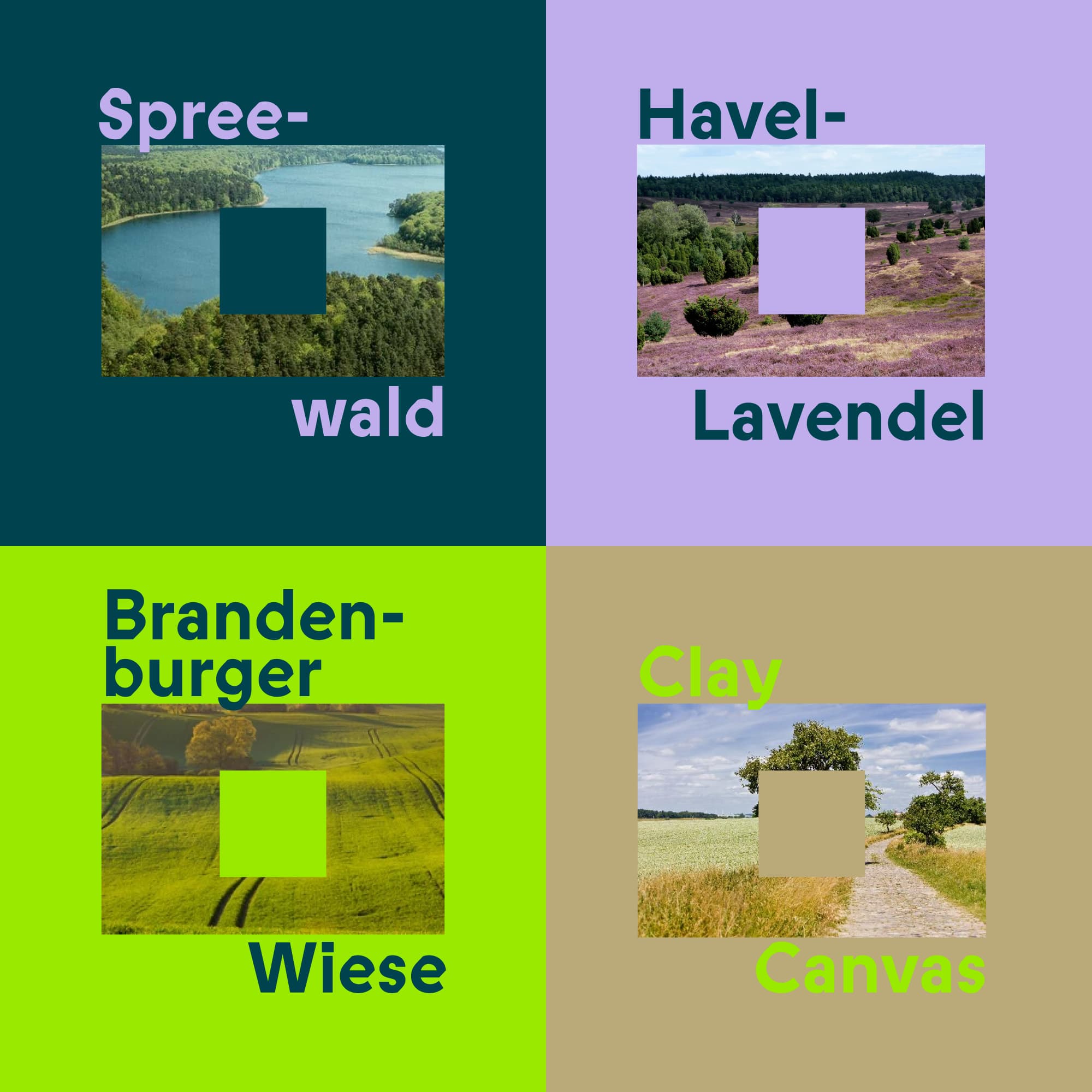
The color palette is inspired by the landscape of Brandenburg.
For internal communication, the system remains reduced, ensuring clarity and professionalism. In contrast, it becomes bold and vibrant in posters and campaigns, designed to capture attention in public spaces. This flexibility allows the identity to adapt to different contexts while maintaining a consistent visual language.


This project was developed as part of a visual identity course led by Prof. Susanne Stahl at the University of Applied Sciences Potsdam.